
Hide or show sidebar
2020-05-28 #css#html
I'm still working on a simple 2-column template. Today my goal is to hide the "sidebar" used for navigation.
An easy solution would be to add a "d-none" class to the "sidebar" (since I use Bootstrap), but that won't be enough because the "content" doesn't automatically take all the width.
Let's go step by step and see what we need to do:
- Hide the "sidebar" => add a "hidden" class to it,
- Make the "content" fill the whole screen => add a "full-width" class.
On the HTML side, this would look like:
<nav id="sidebar" class="hidden">
    ...
</nav>
<div id="content" class="full-width">
    ...
</div>
And on the CSS side:
#sidebar.hidden {
    display: none;
}
#content.full-width {
    width: 100%;
}
And vice versa, when I need to display the navigation bar again:
<nav id="sidebar" class="visible">
    ...
</nav>
<div id="content" class="less-width">
    ...
</div>
Then the CSS part:
#sidebar.visible {
    display: block;
}
#content.less-width {
    width: calc(100% - 299px);
}
It works! Now let's see how to get the same result but with less complications.
My first attempt needs 4 different classes, whereas there are basically only 2 cases:
- We show the "sidebar" and the "content" => sidebar = true (default),
- We only display the "content" => sidebar = false (on demand).
What can be done with a single "no-sidebar" class:
- By default this class is not used => the "sidebar" is visible,
- And to hide the "sidebar", we just have to add this class.
To be clever, we can do this at the "wrapper" level, which includes "sidebar" and "content":
<div id="wrapper" class="no-sidebar">
And this time I only need two CSS rules:
.no-sidebar #sidebar {
    display: none;
}
.no-sidebar #content {
    width: 100%;
}
Much better!
Now, all we need is a button and a bit of Javascript to show or hide the "sidebar".
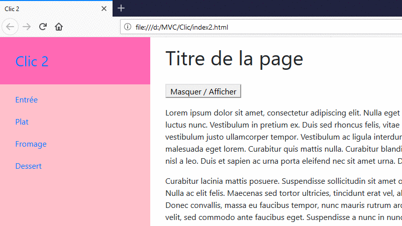
<button id="sidebar-toggle">Masquer / Afficher</button>
The Javascript code is really simple (because jQuery will be used later for the forms):
<script src="js/jquery-3.4.1.min.js"></script>
<script>
    $(document).ready(function () {

        $("#sidebar-toggle").on("click", function () {
            $("#wrapper").toggleClass("no-sidebar");
        });

    });
</script>
To summarize, we need just 4 elements to build a 2-columns template, with a switchable sidebar:
- A "#wrapper" div to enclose all the content,
- A "#sidebar" nav to contain the navigation menu,
- A "#content" div to present the main content,
- A ".no-sidebar" class when you need to hide the sidebar.
And finally, very little CSS (without styles used to presentation):
#wrapper {
    display: flex;
    width: 100%;
}

#sidebar {
    min-height: 100vh;
    position: fixed;
    width: 299px;
}

#content {
    min-height: 100vh;
    position: absolute;
    right: 0;
    width: calc(100% - 299px);
}

.no-sidebar #sidebar {
    display: none;
}

.no-sidebar #content {
    width: 100%;
}
And if necessary hide the "sidebar" when printing (as it is intended to contain navigational elements only):
@media print {
    #sidebar { display: none;}
    #content { width: 100%; }
}
We can also just add the bootstrap "d-print-none" class to "sidebar".
Yay! My first animated GIF for centuries, or at least since the last century (created with https://ezgif.com/).
It wasn't complicated... So I would probably write a third part to work on the "artistic" side:
- Use an icon to show or hide the sidebar,
- Add an animation to switch from one state to another.
Version en français : Masquer ou afficher le menu latéral.