Create a basic template with sidebar + content
2020-05-20 #css#html
I'm doing some tests on a management application and rather than having a "complicated" navigation bar at the top of the screen, I'd like to test what a basic template with only 2 columns would look like:
- a sidebar for navigation,
- a main area for all site content.
I've found a lot of examples and even ready-made templates to achieve this result, but they usually do much more than I need, and above all, I'd like to understand how it works.
To simplify, I'm going to do this with Bootstrap 4, drawing heavily on what I've seen in various tutorials and templates that exist. The first thing to do is to have two div blocks:
- "#sidebar" for the navigation sidebar,
- "#content" for the general content area.
In order for these 2 blocks to stay side by side, they must be enclosed in another div block, the "#wrapper":
<div id="wrapper">
    <nav id="sidebar">
        ...
    </nav>
    <div id="content">
        ...
    </div>
</div>
The easiest way to achieve my goal is the "flexible" box model:
#wrapper {
    display: flex;
    width: 100%;
}
Then I set the size of the 2 zones (with some pink to see what's going on):
#sidebar {
    background-color: pink; /* debug */
    width: 299px;
}

#content {
    width: calc(100% - 299px);
}
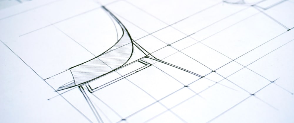
It's not quite finished, but it looks like what I want to do:
I'm making a first improvement so that the "sidebar" uses all the height:
#sidebar {
    min-height: 100vh;
}
Much better!
I can check what happens when scrolling by adding some HTML at the end of "content":
<p class="scroll">...</p>
<p>La fin.</p>
Then some CSS:
.scroll {
    margin-bottom: 50rem;
}
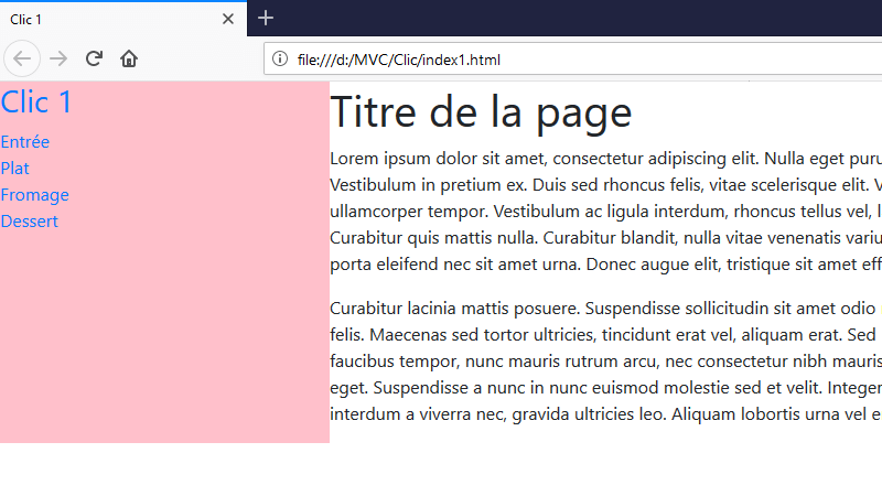
It works. But the "sidebar" scrolls with the rest of the page. I'm not sure it bothers me that much. But let's say I want to stick the navigation, so I have to prevent it from scrolling with the rest of the page:
#sidebar {
    position: fixed;
}
OK. The "sidebar" no longer moves. On the other hand, the "content" is displayed below the "sidebar", aligned on the left side of the screen...
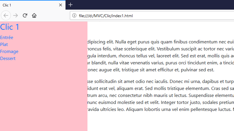
I have to find a way to fix it to the left of the "sidebar", or rather to the right of the screen:
#content {
    position: absolute;
    right: 0;
}
This is better:
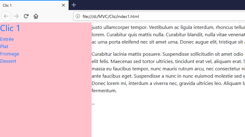
I can now work on the aesthetic side of the thing.
To start, make sure the content look less packed:
#content {
    padding: 15px 30px 30px 30px;
}
h1 {
    margin-bottom: 30px;
}
Then make the navigation links fully clickable, with a small hover effect:
#sidebar a {
    display: block;
    padding: 30px;
    text-decoration: none;
}
#sidebar .sidebar-menu a {
    padding: 10px 30px;
}
#sidebar a:hover {
    background-color: hotpink;
}
Well, it's not a bad start:
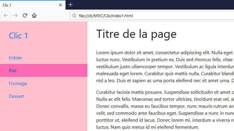
That's exactly what I'd look for, plus I did it! Well, to tell the truth, I wish I could hide the "sidebar"...
Version en français : Créer un template simple avec sidebar + contenu.