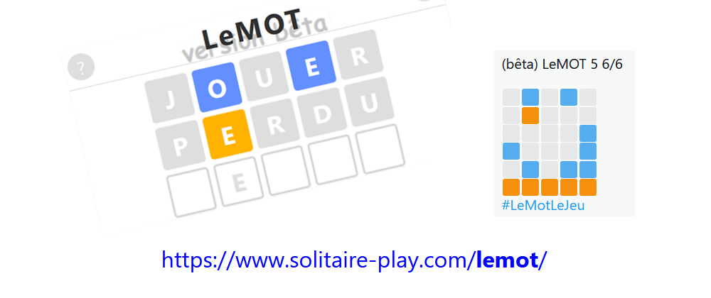
Accessible colors for LeMOT
2022-01-14 #javascript#jeux
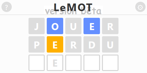
I really thought about it and decided to change the color of the clues in my game Wordle in French.
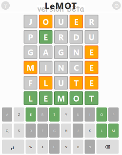
This past Saturday, when I created LeMOT, I picked the colors used by Josh Wardle.
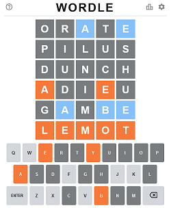
In the original Wordle, there is also a "Color Blind Mode" with more contrasting colors for people who are color blind.
I can't find it, but a few days ago I saw a tweet saying that it would be easier to directly use colors suitable for everyone, rather than offering them through a setting.
Since my game is in its early days, that's what I did. And now my version of Wordle in French uses directly accessible colors for people with visual impairments.

I started with the "IBM Design Library" color palette found in the Coloring for Colorblindness article by David Nichols. I then tested it with the accessibility tools provided by Firefox and found that it was fine.
Demonstrations
No red (protanopia)
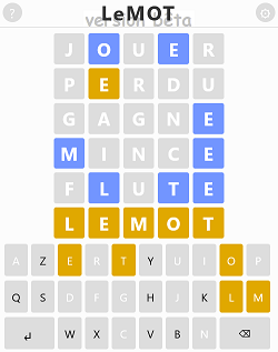
No green (deuteranopia)
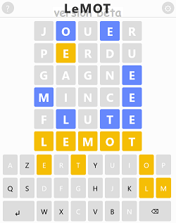
No blue (tritanopia)
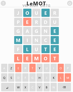
No color (achromatopsia)
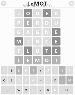
Note: I also took the opportunity of this color change to increase the font size for nearsighted people like me, to have less shades of gray and to use a darker black font for the text.
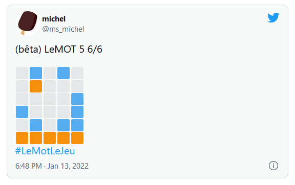
Impact on the result grid
I have of course adapted the result grid invented by @irihapeta to adopt the same color scheme. Although I know it doesn't change the problems that all these emojis generate for screen reader software.
Advantages of accessible colors
One, everyone can play directly, without having to think about where and how to set up the game.
Two, colors are as pretty as the original ones (if not prettier).
Three, I don't need to code a screen to set it up, nor to save this setting to reactivate it on each visit.
Note: Colors are now accessible for colorblind people, other elements of the game are not accessible.
Disadvantages of new colors
The color of emojis in the result grid will probably confuse people, but I don't know what to do... Except of course to generate a more accessible one, which is not an easy thing to do right now. But normally, seeing the last line all orange, people will understand that it's represent correct letters.
What is a bit more annoying is that players are getting used to GREEN = correct letter and ORANGE = present letter. Except for some beginners who are still hesitant and frequently have to display help :). Not to mention the confusion for those who play Wordle in French and English.
But for that, I found a great solution that I'm very proud of!
When a letter is correct, I repeat it as a watermark on the next line. With this, you can play immediately without having to think about the color code and concentrate all your available human brain time on finding the right word.
Whatever! It's time to go play Wordle in French :)
Version en français : Des couleurs accessibles pour LeMOT.