5 improvements for a better solitaire on smartphone
2020-01-07 #css#javascript
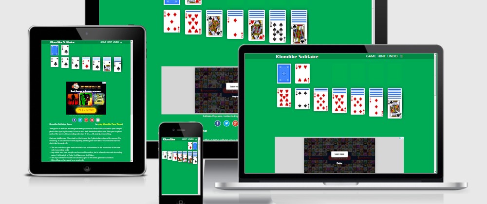
The different solitaires on my Solitaire-Play game website are all "responsive". Which is very interesting since it means that they work properly on a desktop PC as well as a laptop, but also on a tablet or iPad and especially on Android or iPhone smartphones ...
I write HTML code that's valid enough, fairly correct CSS code, and JavaScript that's pretty much all-purpose. This allows me to be quite quiet and to make a lot of changes without having to check everything on different systems every time.
But from time to time, it's not useless to take a look to check that everything is still working as I want it to. And so, during my holidays, I took a little tour to make sure that everything was fine when my site was used from a mobile phone.
Result: it's working well, but I still found some points to improve.
Disable "pull-to-refresh"
The "pull-to-refresh" is the gesture of grabbing the top of the screen and sliding it down. It is a gesture that has been popularized by the mobile applications of Facebook and Twitter where it's used to "free" space at the top of the screen to display more recent information. And now Google is sawed off! What? There's a new UX so good, I have to do the same with Chrome on Android.
But I didn't know about that. And when I was playing on a phone, the screen was refreshed from time to time and the game in progress disappeared. Until recently, I thought it was because I was old and didn't have 2 thumbs like young people to type correctly on a phone :(
Then one day I got tired of it and looked for why Google was making me lose when I was finally going to win. And from thread to Stack Overflow, I came across a page explaining how to regain control of my scroll: Take control of your scroll: customizing pull-to-refresh and overflow effects.
So, to say no thanks I don't want to be bothered by the pull-to-refresh anymore, all I need is a single line of CSS:
body {
  overscroll-behavior-y: contain;
}
Disable "hover" / Enable "ripple"
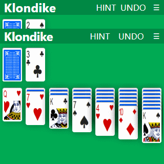
That's a classic problem with smartphones: since there is no mouse, they cannot know when you're hovering over something with your finger, so they can't apply :hover styles. Instead, they apply these :hover styles in the case of a :focus. And once you press a button, it takes the "focus" with CSS styles that go with the "hover".
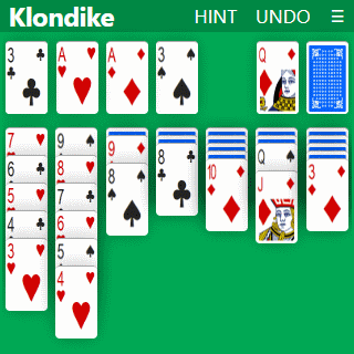
In my case, I paint the buttons in blue when the mouse hovers them to show that this is where you have to click. And on a phone, after pressing the "HINT" button, it remained blue to show that I needed help to play Klondike Solitaire.
So, the solution is simple, just don't style :hover in the case of phones and probably tablets. To know if it's a phone, it's easy: if it's small, it's a phone. For "probably tablets", it's a little more tricky. Personally, my CSS doesn't make too much difference between a tablet and a PC and there are tablets that have stylus. Who knows if a pen can handle :hover!
That's where I got a bit confused. I'd just switched to DuckDuckGo and I had a little trouble knowing what to ask to find the "best" results. So I came across the article How to deal with :hover on touch screen devices and especially The "Hover Effect" for Mobile Buttons.
The latter explains very well what the "ripple" effect is and how it works.But I read that a little bit across the board and I followed the "ripple effect" link on CodePen a bit too quickly and found myself trying to do the same on my site. I had gone from "how to remove the hover" to "how to make a CSS ripple".
I'll make it short. On a phone, you don't need to do anything to make the buttons have a "ripple" effect: the browser does it. So I could just remove the "hover" styles (the blue one in my case) for browsers that don't support it:
h1 a:hover, button:hover {
  background-color: #05f;
  color: white;
  text-decoration: none;
}

@media (hover: none) {
  h1 a:hover, button:hover {
    background-color: #084;
    outline: none;
}
The @media(hover) documentation on MDN.
Otherwise, I've also put an outline: none (but I know that I shouldn't do this: Never remove CSS outlines) so that after pressing a button there's no border around it to show it still has focus.
Enlarge buttons
The top of the screen of each solitaire game display a menu bar with the name of the current game and 4 buttons which allow:
- "GAME": start a new game
- "HINT": get a tip on how to play
- "UNDO": undo the last move played
- "≡": choose another solitaire game
First, with "old" smartphones in vertical mode, I hide the "GAME" option and you have to click on the game title to start a new game:
@media (max-width: 22rem) {
  #game { display: none; }
}
Until I can do better, I have slightly enlarge the buttons in this menu:
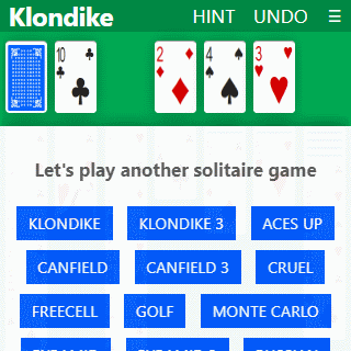
Display the list of games correctly
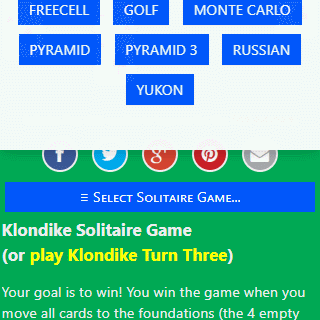
On smartphones, in addition to the "≡" button in the menu bar to select another solitaire game, there is a "≡ Select Solitaire Game..." button underneath the Twitter, Facebook, Pinterest... buttons.
The problem is that when you clicked on it, the list of available solitaires was displayed at the top of the page, and therefore possibly above the top of what was visible on the screen:
I could have thought of that before, but I fixed it to make a window.scrollTop() before displaying the popup, which allows you to see all the existing games (as long as there aren't too many):
Move the stock to the right
By playing more regularly I noticed that I had a problem with the way I was playing:
- I move my right hand, pointing to the deck on the left side of the screen
- I
clickpress on the stock to draw a card - I take my hand away so I can see the tableau and check if the new card can go somewhere
- I move my right hand back to the left side of the screen to redeal...
It would be easier if the stock pile was on the right side of the screen (or if I was left-handed). Or maybe, if I could use all my fingers, I wouldn't have that kind of problem. However, when searching for "Klondike Solitaire Mobile" images, you can see that the stock is often on the right side.
Therefore, I also transferred the stock from the left side to the right side of the screen:
At first, I did this the "complicated" way:
@media (max-width: 575.98px) {
  .reverse {
    display: flex;
    flex-direction: row-reverse;
  }
}
Then given that my grid system is already based on float: left, it can be much simpler:
.column {
  float: left;
  width: 14.2857%;
  ...
}

@media (max-width: 575.98px) {
  .reverse .column {
    float: right;
  }
}
Conclusion
It wasn't very complicated and I hope that players who use Solitaire-Play from their phones will enjoy it.
For the future, I have to work again on the transformation of the site into PWA. I have already started to do a few things, in particular switching to HTTPS, using system fonts rather than "Century Gothic" and setting up the HTML tags for the Open Graph protocol. In theory, I "only" have to create a manisfest.json file and then code a Service Worker.
Or, I could also try to save the progress of a game with window.localStorage to come back to current game?
Version en français : 5 améliorations pour un meilleur solitaire sur smartphone.