How to create a badge / avatar in CSS
2021-12-11 #css#html
Some time ago, I built a small application to easily review my helpdesk tickets. I no longer use this program, but it gave me the opportunity to present the exchanges as a conversation. As a backup, I'm writing here how I displayed the badges to identify the users.
To start, I create a 100px by 100px square with rounded corners thanks to the border-radius property at 50% so that the square becomes a circle. Then I color it in green so that it's visible on a white background and I add a silver border thick enough to make it stand out even better.
<style>
  .badge {
    /* A green circle */
    height: 100px;
    width: 100px;
    border-radius: 50%;
    background-color: limegreen;
    border: 10px solid silver;
  }
</style>

<div class="badge"></div>

Then, I add the initials of the user who wrote the ticket or comment, in white, in big and in bold.
<style>
  .badge {
    /* A green circle */
    height: 100px;
    width: 100px;
    border-radius: 50%;
    background-color: limegreen;
    border: 10px solid silver;
    /* White initials */
    color: white;
    font-family: -apple-system, BlinkMacSystemFont, "Segoe UI", Helvetica, Arial, sans-serif;
    font-size: 55px;
    font-weight: bold;
  }
</style>

<div class="badge">AB</div>

And now I just have to center these initials horizontally and vertically. Fortunately, others have been collecting solutions for a long time to center everything with CSS...
I am using the flexbox method:
<style>
  .badge {
    /* A green circle */
    height: 100px;
    width: 100px;
    border-radius: 50%;
    background-color: limegreen;
    border: 10px solid silver;
    /* White initials */
    color: white;
    font-family: -apple-system, BlinkMacSystemFont, "Segoe UI", Helvetica, Arial, sans-serif;
    font-size: 55px;
    font-weight: bold;
    /* And centered */
    display: inline-flex;
    justify-content: center;
    align-items: center;
  }
</style>

<div class="badge">AB</div>

I would say that it's not quite in the center and that it falls a bit downwards. But it's super simple and it solves my problem quite perfectly.
In the original application, I had a piece of server code to generate a background color based on the user's trigram. But I'll leave that aside for now.
Also, I managed the use of images instead of initials to better highlight some users in the conversation. For that, I used drawings by Cameron Mark to represent the two people affected to level 1 helpdesk.
To be simple, the modification needed to replace the initials with a photo consists of two things:
- Display the image corresponding to the person,
- Hide initials that I no longer needed.
<style>
  .badge {
    /* A green circle */
    height: 100px;
    width: 100px;
    border-radius: 50%;
    background-color: limegreen;
    border: 10px solid silver;
    /* White initials */
    color: white;
    font-family: -apple-system, BlinkMacSystemFont, "Segoe UI", Helvetica, Arial, sans-serif;
    font-size: 55px;
    font-weight: bold;
    /* And centered */
    display: inline-flex;
    justify-content: center;
    align-items: center;
  }

  .badge-avatar {
    /* Hide initials */
    color: transparent;
    /* Show image */
    background-image: url("https://blog.pagesd.info/public/2021/queen-of-hearts.png");
    background-position: center;
    background-size: cover;
  }
</style>

<div class="badge badge-avatar">AB</div>
The line background-position: center makes sure that the image is centered. And with background-size: cover, the picture is resized to be as big as possible (and thus fill the badge as well as possible), while keeping its proportions.

To add some fun, you can animate the badge when the mouse hovers over the element that contains it, by changing the color of the border.
  :hover > .badge {
    border-color: orange;
  }
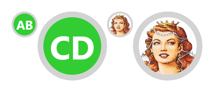
It's almost done. In practice, a 100 pixel wide badge (not counting the 10 pixel borders) takes up a lot of space. And so, in order to be able to define badges of different sizes, I use CSS variables to redefine the height and width of the badge, but also the border size and the size of the font.
<style>
  .badge-75 {
    --badge-size: 75px;
  }

  .badge-200 {
    --badge-size: 200px;
  }

  .badge {
    /* A green circle */
    height: var(--badge-size);
    width: var(--badge-size);
    border-radius: 50%;
    background-color: limegreen;
    border: calc(var(--badge-size) / 10) solid lightgray;
    /* White initials */
    color: white;
    font-family: -apple-system, BlinkMacSystemFont, "Segoe UI", Helvetica, Arial, sans-serif;
    font-size: calc(var(--badge-size) / 1.75);
    font-weight: bold;
    /* And centered */
    display: inline-flex;
    justify-content: center;
    align-items: center;
  }

  .badge-avatar {
    /* Hide initials */
    color: transparent;
    /* Show image */
    background-image: url("https://blog.pagesd.info/public/2021/queen-of-hearts.png");
    background-position: center;
    background-size: cover;
  }
</style>

<div class="badge badge-75">AB</div>
<div class="badge badge-200">CD</div>
<div class="badge badge-avatar badge-75">EF</div>
<div class="badge badge-avatar badge-200">GH</div>
There you go ! Only 30 lines of CSS for a pretty good result. Now, if I ever need it again, I'll know where to find it.
Version en français : Comment créer un badge / avatar en CSS.